

This is a brief user experience review of a AGODA app. It’s not a super in-depth analysis, no ticking checkboxes of the heuristics, but it’s more like an overview following my own structure, which covers welcoming experience, ease of achieving goals, general feedback and consistency of visual design.

So AGODA is a mobile application, which helps you to book accommodation and flights for your holidays. Tested on iPhone7.
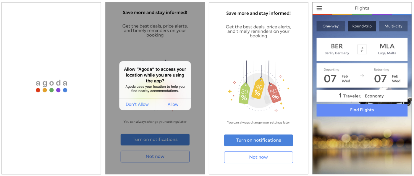
Welcoming. Here we go Agoda is on my phone. No bullsh*t, no intro slides, no tutorials, tips&tricks — nothing. Logo, some animation and you are in, go and use it. I must admit, that I’m always a fan of this go and use it approach, but even for me this was slightly too direct. I wouldn’t mind so see one slide or a sentence next to a logo ‘find flights, book apartments with us’ or something like that. Before downloading it I just read that it’s a travel something app and there was plenty of assumptions in my head — flights, hotels, apartments, cars, experiences etc. Well, yes, I figured out things quickly, but anyways, slightly warmer welcome would be appreciated.
Therefore, as there was no intro, it felt a bit unpleasant to receive two access permission requests straight after the logo animation. And they were delivered weirdly in different manner (pic.2,3). I understand that there can be technical restrictions or whatever, but just make them both nice and it would work as a smooth onboarding.
So we are in and we land in ‘Book a room’ page (pic.4). Again no bullsh*t. You want to book something, here you go, no distractions, no annoying overlays explaining the obvious. Well, actually thanks to a super simple and familiar interface, therefore there is no need for extra explanations.
Another great thing was that they are not asking to create your account straight away. Actually you can even proceed searching without being signed in. I find it as a great advantage. I try, I like, I sign up, not the vica versa.
Kicking the goals. Once user opens the app, they have two main goals — to find and book a flight and accommodation, probably to manage them as well, but this is too far in the future. What I found interesting, that from my standpoint it would seem that both booking options are equally important and core businesses of the app, but in the home screen we always see ‘Book your room’ (pic.5) and if we want to find a flight, we have to go and look for that option in hamburger menu. Strange that such important features are placed under a hamburger menu. In general, I’m not against this solution, but only for the secondary functions, primary ones should be accessible from the home screen with one tap — ‘Book a room’, ‘Find a flight’ and check ‘Your account’.
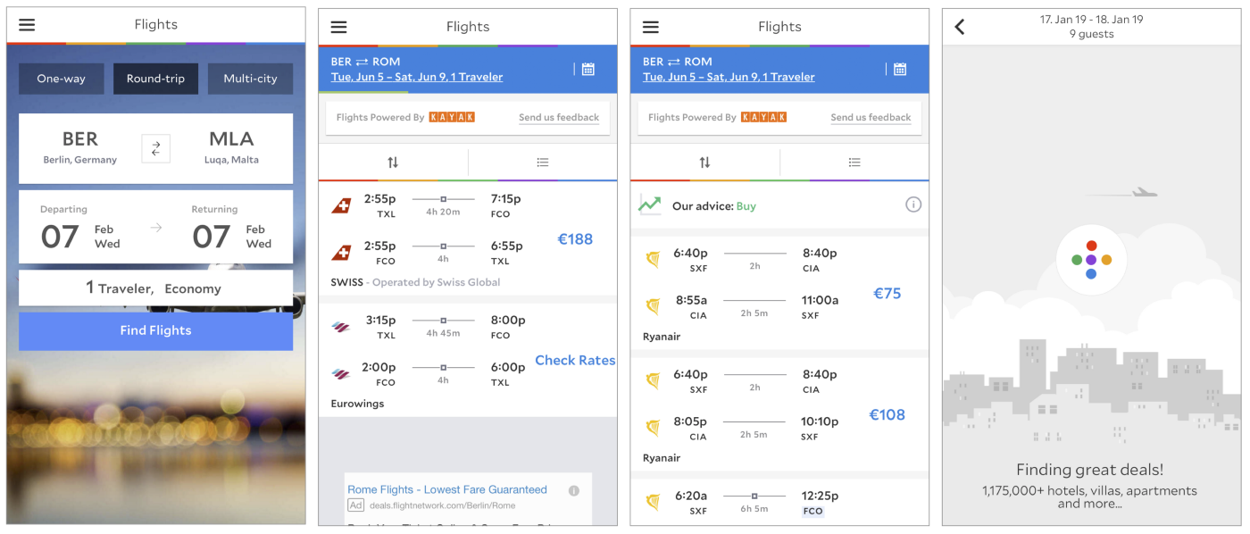
Anyways, let’s book a flight (yes, in the menu accommodation goes before the flights, but in real life I always look for flights first). I’m entering the details, all good, even though the main action button probably could be slightly bigger than the height of a search field above as it felt slightly smallish. Tap it and I’m brought to another screen (pic.6), I can see search results appearing, tiny green line (under the blue box) is showing me progress of the search and then it disappears…. That’s it? Well, the price you are showing me as the cheapest is not so cool…. But! Apparently the search is still happening and better results keep on appearing (pic.7). Really crucial to add a proper, clear and informative progress indicator here. There are also those two lines with brand colours just animate them and add a copy of what’s happening. And another nice loader they are using (pic.8), so it’s fine to go with that circle as well, just overlay the screen and say ‘we are looking for the best offers’ or something.
I like the interface of the results (pic.7), clear and simple. Even though I’m not so sure if it’s necessary to show a list of 60 items… Who’s gonna check option number 48?.. Maybe just show 30 and in the end write ‘we found 156 flights’ and a button ‘Show more’ under it. Plenty of sorting and filtering options, which is great.
So I select one flight option and then I go to another screen with more details. Seems clean and clear, then you click ‘view’ and go to a page of the price offer. This time I didn’t continue with a booking, but general feeling is that it’s working well and is trustworthy.
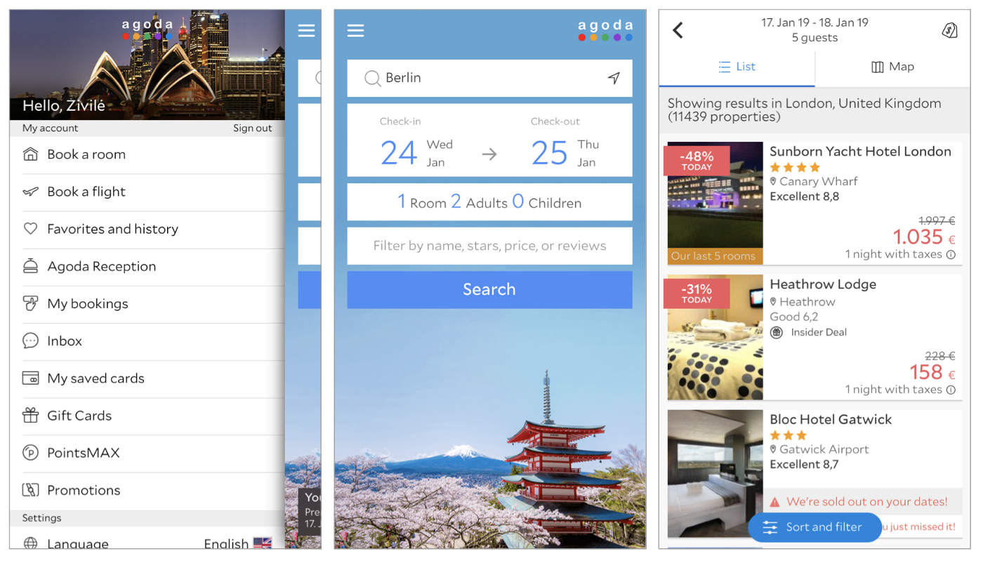
Now we need to book an apartment. Go back, back, back, hamburger menu > ‘Book a room’(pic.9). Hmm. Search screen is very simple and easy though. The interface of the results is looking clearly different. Yes, I understand that it is partially because products are very different, but the amount of messages, discounts, proposals are nowhere even close to what was in the flights view. And … it sounds a lot like bookings.com. ‘We’re sold out on that day’, ‘You just missed it!’ etc.
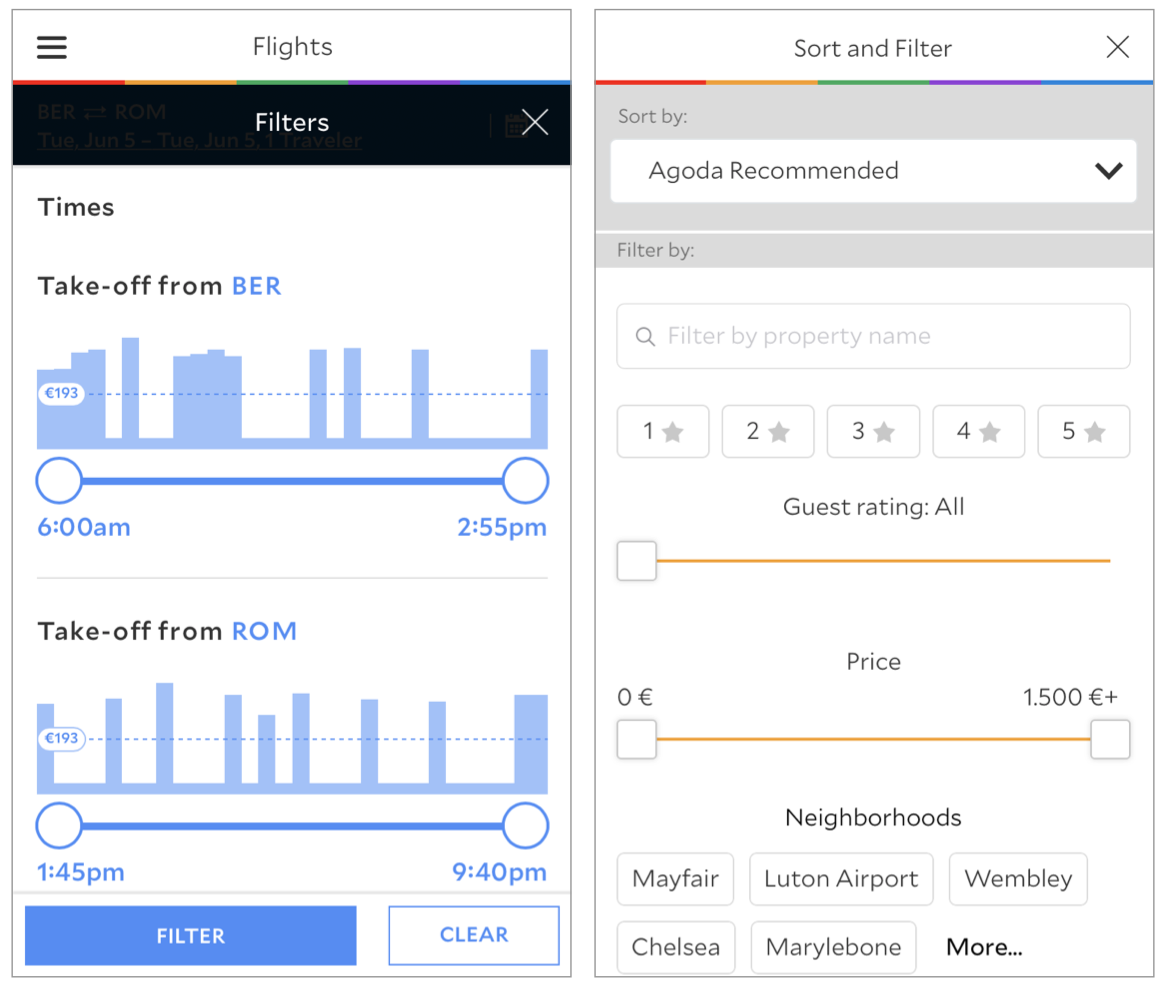
Good filtering options even though I missed one — ‘do not show sold out properties’. However another funny thing! Filter button, its functionality and visual appearance in here (pic.13) is completely different from the one in flights section (pic.12). Is it because search engine of flights is powered and designed by Kayak?
So in general both sections do the job and users can achieve their goals, but the bird-eye view over those two is a bit confusing.
Bonding (feedback). As I haven’t completed the full booking process, it’s hard to tell, what is the feedback, when it comes to most important steps of the journey, but in general, I felt positive as in most of the cases I felt aware of what is happening — messages in empty state screens, clear error notifications. Even though there is still some room for improvement. Most important one could be a proper feedback, when the system is searching for flights.
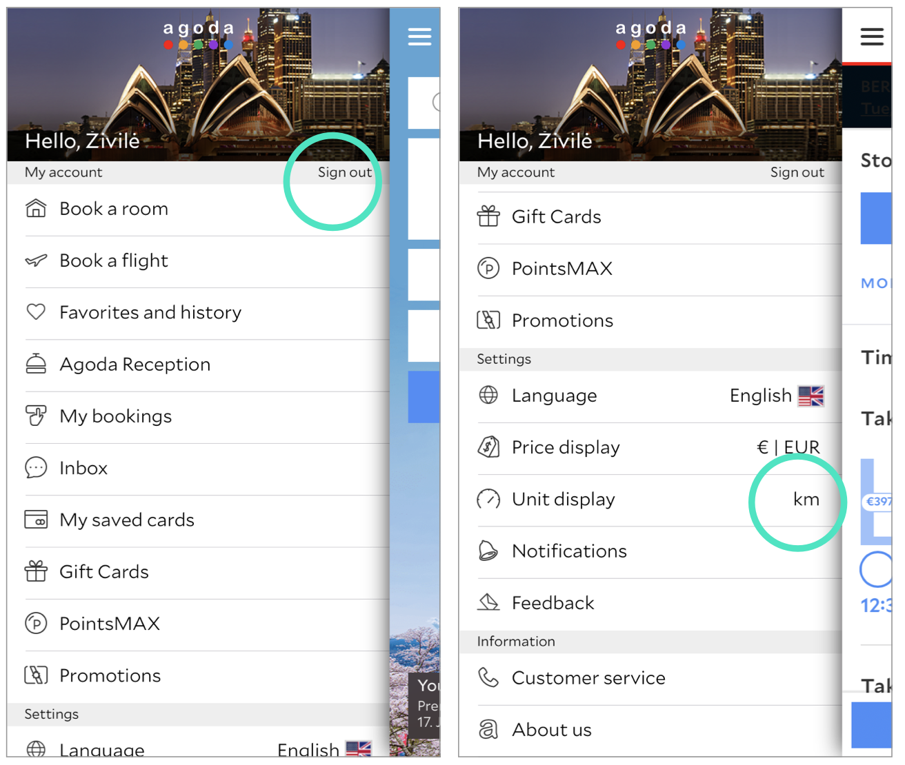
Then I had a situation, when I tried to log out. Button for that is super weird and very tiny (pic.14). Not sure if it can even be called a button. I clearly wasn’t sure, what is it and what will happen, if I press it. *Taps* Out! No ‘bye’, ‘are you sure of what are you doing?’, ‘this is the door out, do you really want to leave?’. Nothing! So a little dialog-box to confirm that my intention is to leave the app would be a good idea.
Another interesting thing is a feature to change the units of display (pic.15). As you can see in the picture, it looks no different from the rest of the items, but it behaves in a different way. I would say that it is a smart solution as you can change units just by taping on it, no need to go to another screen, but then there should be a clear indicator of that. As now I was just clicking on it multiple times and thinking that this feature is not working, because I was actually covering the changing units with my own thumb. So maybe just change the colour once the element is tapped? Or different colour of the units?
Experience (visuals, tone of voice). From the screenshots above you probably already noticed, that Agoda is no way following iOS11 or any iOS guidelines whatsoever. General feeling is definitely more like Material design, but as I’m not iOS guidelines is our Bible type of designer, I’m not going to judge on that. However there is another problem — lack of brand identity. It looks kind of materialdesignish, but not completely, some elements resemble iOS, but also just a few. So talking from branding perspective there is no visual identity of the product.
Nevertheless, talking about visual design, there are some positive things — like great style and consistency of the menu icons (pic.14). Not sure how they fit with other visual elements, but they are definitely pleasant.
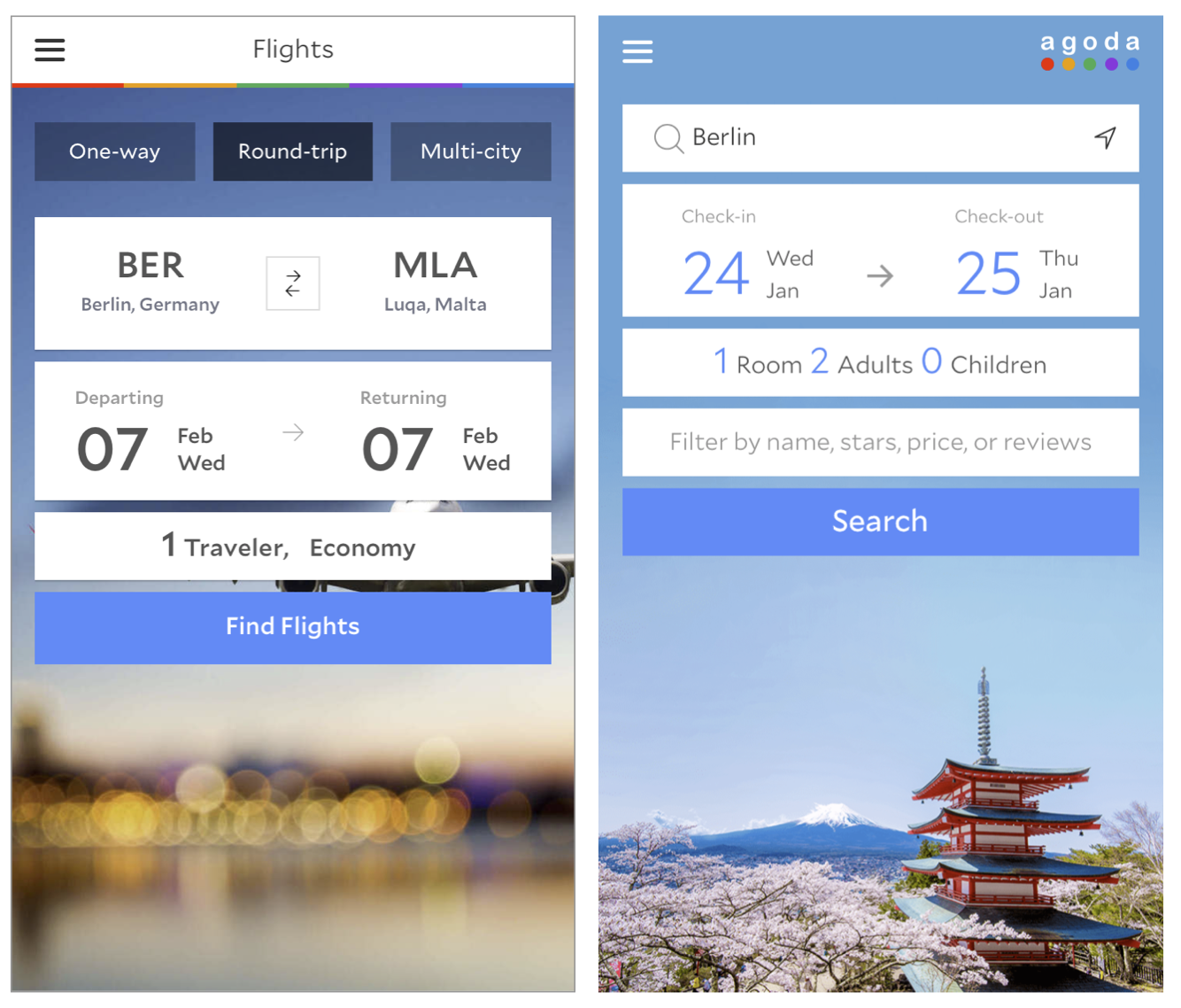
Now the bummer…two screens of their most important features ‘Book a room’ and ‘Book a flight’. Well, clearly there are two separate departments working on them… Composition and style of the background pictures, fonts, colours and even copy on CTA buttons are different (pic.16,17)…
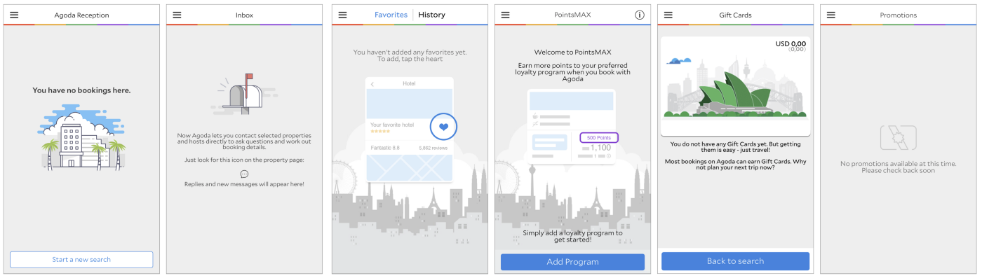
Some good news — illustrations of the empty states (pic.18). Looking nice, the style similar to icons so thumbs up, but… as you can see above there are a few different styles of them… Okay, they are outlined with grey, white and some extra colours, but then one or two extra colours? Because the first illustration just because of one extra colour looks completely different, compared to illustration 2. Also, the rest of the illustration look like they are from three different apps. Consistency, por favor! By the way, great UX to explain a feature with an illustration, but why different background?
Some thoughts on the background photos (pic.16,17)— first of all, they should not make any element of the logo look ugly, now the green dot is basically invisible. And the composition of the photos should be consistent and fit with other elements of the screen. Now in the flights section main element of the picture is hidden, then why use such a picture, if we can see only 1/9th of it? Meanwhile in ‘Book a room’ the object of the photo is well positioned and clearly visible.
The tone of voice. This also wouldn’t be the strongest side of the app. In most cases it is informative, does its function, but sounds just like a message from a machine. My favourite was ‘Verify your humanity’. I know this is a common label for captcha, but what about adding please, or just something sounding less like a robot?
Even though most of the feedback wasn’t so cheerful and praising, but again the core thing is making an app usable and understandable, never mind those icons, no intro slides or inconsistencies as long as an average user can achieve their goals easily. And the rest can be improved on the way.